Mark Pedersen

Komand
Cybersecurity Orchestration Software

My Role
Research
User Flow
Sketching
Wireframing

Timeframe
One Week

Tools
Pen
Paper
Sketch
The Challenge
A solo design project for a Boston startup, Komand.
The challenge set forth by Komand was to:
- Streamline the Job Details screen to become more concise and actionable
- Enable users to make informed decisions in a timely manner
- Allow users to quickly make decisions across multiple, unrelated jobs
Sketching
After conducting Product Owner research, I began to produce hand sketches.

Current Job Details Screen
I started by sketching the current Job Details screen in order to get a true feel of the design scheme.

New Design Options
I then sketched four different potential new design options.

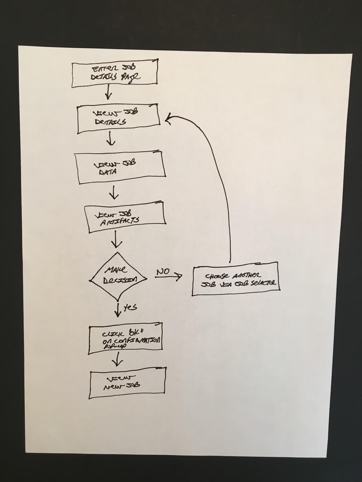
User Flow
The user enters the Job Details screen and is able to view the job data or job artifacts. If the user is required to make a decision, then he or she will do so, be provided with a confirmation pop-up, and then proceed to a new job. If the user is not required to make a decision, he or she can proceed to another job via the Job Selector tool.
Design Changes
1. Create a new Job Selector tool, allowing users to quickly move between workflows and jobs of their choice
2. Remove the Workflow from the Jobs information area and make it a feature in the new Job Selector tool
3. Remove the To Investigation button and incorporate that feature as part of the Decision Required section
4. Move the Decision Required section to the left side, to create a central control panel and create space for additional data boxes
5. Create a third column of like data boxes (decision data boxes), thereby still grouping like items together, while reducing scrolling
6. Increase the size of the Search Box, with the new space that opens up from moving the Decision Required section
Before

After

Final Thoughts
Redesigning the Komand Job Details page was a fun challenge. It required learning a lot about the different forms of data available to a cybersecurity professional during an email phishing incident. Going forward, I would like to see usability testing conducted on the new design. In particular, it will be interesting to see how users interact with the new Job Selector tool.