
Edge boardshop
Shred like a pro.

My Role
User Interviews
Affinity Diagram
Contextual Inquiry
Competitive Analysis
Information Architecture
Ideation & Sketching
User Flow
Persona Development
Storyboard
Paper Prototyping
Wireframing
Interactive Prototyping
Usability Testing

Timeframe
Two Weeks

Tools
Paper
Pen
Sketch
InVision
Optimal Workshop
The Challenge
This solo design challenge while at General Assembly was to redesign an e-commerce website, Edge boardshop - a boutique retailer of skate products and accessories - up to and including medium-fidelity wireframes. What added a layer of complexity was the fact that the skateboarding community is a tight-knit group, relatively closed off from outsiders. It was clear that finding a willing user base and gleaning insights, would be no easy feat.
Orignial Edge Website

Competitive Research
I began by analyzing the competition. I first visited two local skate shops: One Gig and Orchard – this allowed me to identify differences in shopping in person and online. More importantly, these visits uncovered information that would be integral to the success of my user research - where to find the skaters.
I then identified and focused on three online competitors: SoCal Skate Shop, The Longboard Store and Switchback Longboards. I sketched the home page of each site and followed with taking an inventory of all the features that each site offered:

Findings
- A couple of sites were very crowded and distracting, while one was more balanced and visually appealing
- Most features were fairly consistent across sites, with the exception of navigation and filtering options
User Research

Contextual Inquiry
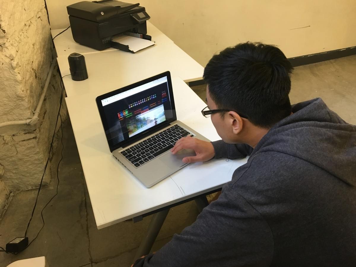
I started by conducting a Contextual Inquiry with an online skate products shopper, in order to gain an understanding of how a skater uses the website. I watched him use the site and asked him to think out loud.
The interview process continued with one-on-one interviews with skaters who had previously purchased skating products online. The participants were asked seven questions in order to identify their feelings about and experiences with shopping online for skate products.
Key Findings
- Site should carry a wide selection of skating products and accessories
- Urban residents have easy access to skate shops - they will use online shopping mostly for parts and customization, due to the large selection offered by online retailers
- Company mission and branding is paramount
- Navigation is important and can be a challenge
- Filtering options are great and used often when they're available
"I want to know that they're truly part of skate culture - not corporate."

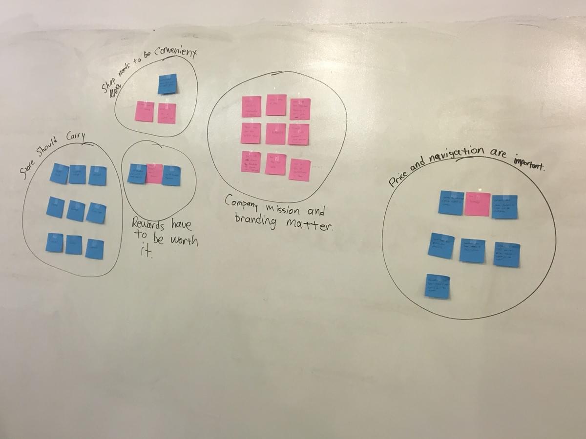
Affinity Diagram
I crafted an Affinity Diagram to condense insights.
"I use filtering just about every time I order from Edge. It's awesome!"
Personas
With my synthesized research findings in hand, I was able to craft user personas for Edge boardshop, to guide me through the rest of the design process.

Ace
16 | Student | Cares About: Performance, Cool-Factor
"I need a sick board so that I can shred with my friends!"
Pain Points
- Too many options when customizing boards
- Pricing needs to beat local skate shops
- Shop needs to show it's truly part of skating culture - not corporate

Susan
46 | Stay-at-Home Mom | Cares About: Convenience
"When I’m looking to buy my son a new board, the site has to be quick and easy to use."
Pain Points
- Getting Lost on a site
- Being bombarded with popups
- Finding exactly what she needs without much effort
Solution
For those wanting to shop for skate products online, Edge boardshop provides an easy way to find and purchase skateboards and longboards, as well as snowskates, clothing and accessories.

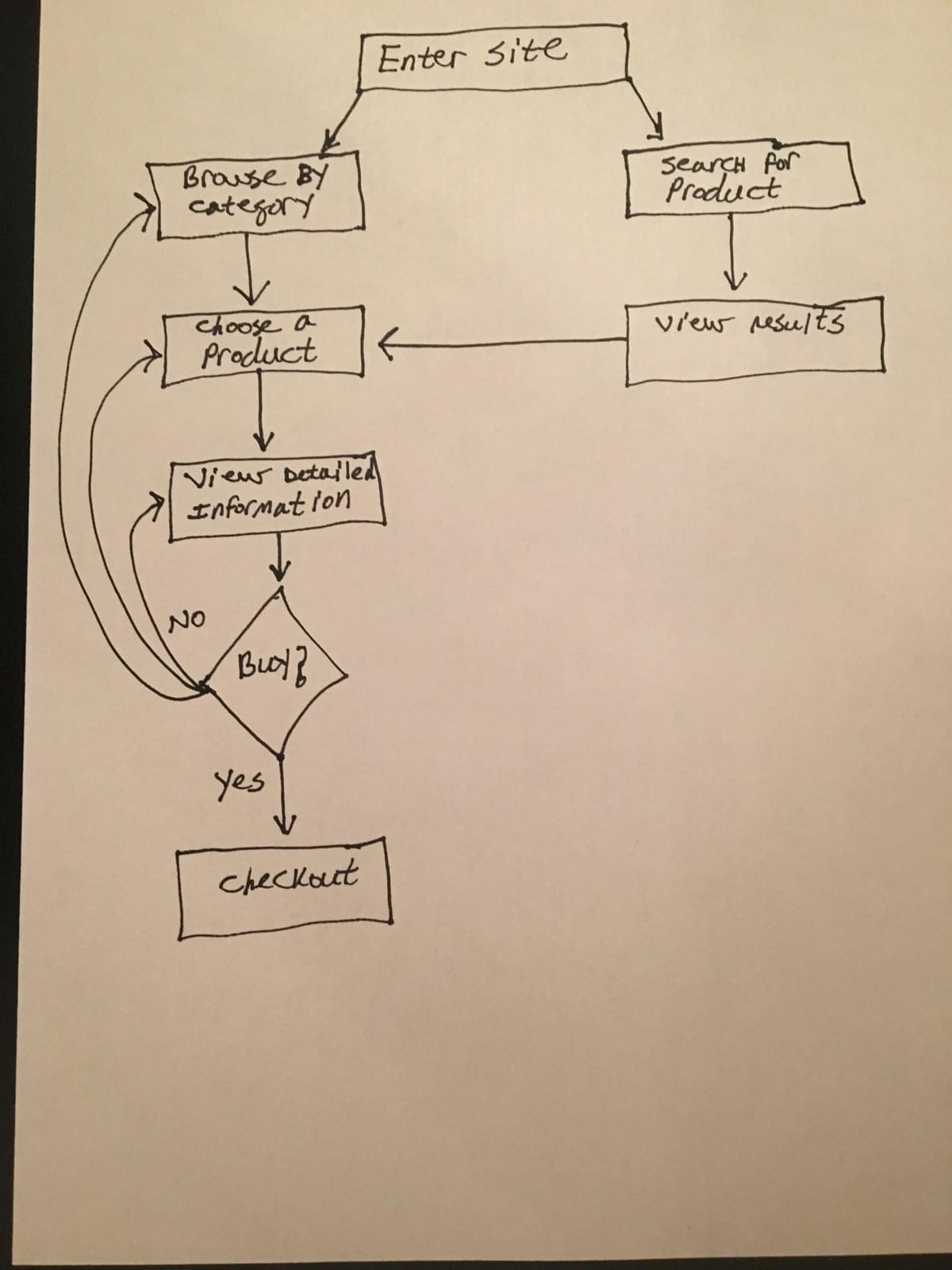
User Flow
Once the user enters the site, she can browse by category or search for a specific product. The user then chooses a product and views detailed information about it. If the user then decides to purchase the product and proceed to checkout. If the user elects to not purchase the product, she continues to view detailed product information, or continues to browse the site.

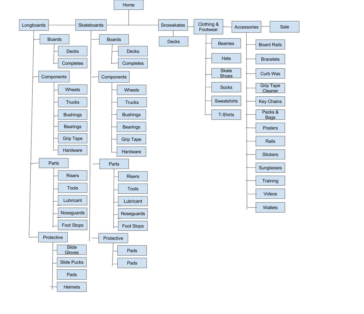
Site Map
The site map illustrates the information architecture of the website, showing how a user will navigate it.
IA Changes:
- Snowskates was moved from within the Longboards menu to the main navigation, to properly reflect its distinct category
- Footwear was added to the title with Clothing in main navigation, to clearly inform users of the product offering
- Categories that were dual-listed in Accessories and other navigation menus were streamlined - listing them under only one menu and removing confusion

Storyboard
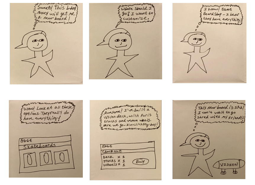
Ace just got birthday money and wants to buy himself something nice with it. He realizes that he's got enough money to buy a new skateboard. He decides to go to Edge boardshop because he wants to customized his board. Ace picks out exactly what he wants - a Vision deck, Paris trucks and Venom wheels. When the board arrives Ace is thrilled and can't wait to shred with his friends that day.
Ideation & Sketching
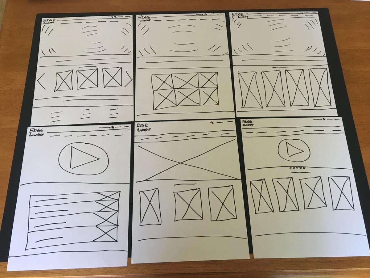
With the research phase completed and personas developed, I was able to move forward with the Design Thinking process and began to ideate. Next, I sketched five to six different versions of the Home, Products Listing and Product pages.

Home Page Sketches
I decided to go with a minimalist look for the site (top-left sketch). Above the fold I'm utilizing a full-screen background image, with visibly present but discreet navigation. Below the fold I chose to showcase a carousel of new products, situated between two banner advertisements that need to be placed in areas of prominence.
Usability Testing & Interactive Prototyping
After choosing a design for the new site, I proceeded to create a set of digital wireframes, leading to an interactive prototype. From there, I conducted usability testing. I repeated testing after each design iteration, culminating in series of five usability tests and six design iterations:
Test Results
- Remove background beneath product images in New Arrivals carousel, which was distracting
- Add product make and model to New Arrivals carousel, providing the user with pertinent information about the product
- Add price to products in New Arrivals carousel, providing the user with essential information that should be available upfront, before deciding whether or not to explore the product further
- Foreshadowed visual design changes needed in the primary and secondary navigation, such as larger text and lighter background

Final Prototype

Interactive Prototype
Final Thoughts
The major challenged I that faced while re-designing this website was balancing the plethora of features that users demanded - revealed through research and testing - with those that Edge boardshop is known for. Further testing in this area would be beneficial.
© 2016


